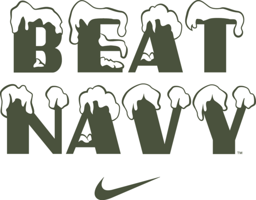
The Design of Army-Navy
CONNECT + INSPIRE
CADET is a bi-annual magazine about West Point culture.
Highly independent, quite unofficial, aggressively dedicated.
Based in DC @chrisWpestel @carolinepestel
Part 1 - The Uniforms
“Fashion is just another word for the constant, inevitable shifts in popular taste. Garments, just like buildings and cars and movies, can’t help but reflect the circumstances of our moment in history. That’s what fashion is. Another way of telling time.”


Both Army and Navy are harnessing the deep, rich history and tradition of the military. Its wonderful that effective storytelling has become the foundation of these uniforms and their elaborate reveals. And now that we are all having fun with Army Football (a shot at back to back 10-win season and ranked #22 in the AP and #25 in the Coaches Poll), lets appreciate this added aspect of our beloved Army-Navy Game. Let’s celebrate that tradition and history. Let’s honor those that came before us. And let’s have some fun doing it.
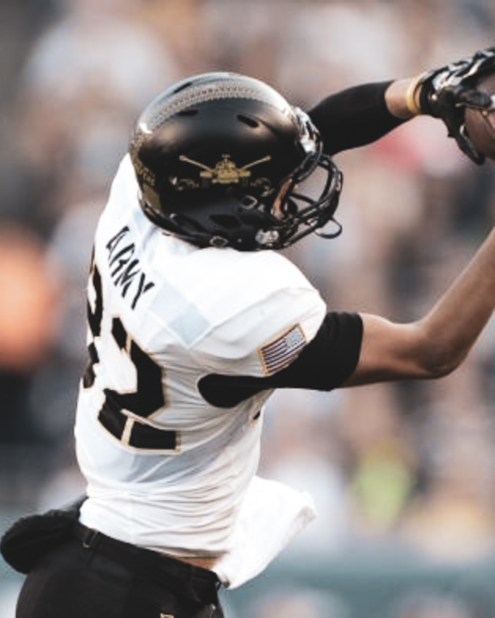
From jersey numbers with an overlay of a map from the Battle of the Bulge to the bad-ass-ery of the 82nd Airbonrne and the lovable Pando Commandos logo there’s so much care, research and subtlety that goes into these designs.
As a design nerd, as an Army fan, as an American. It’s truly wonderful.
In late September I began listening to a 6-part series from podcasting giants 99% Invisible called Articles of Interest. This was around the time Army Football was licking its wounds after a heroic effort against powerhouse Oklahoma and before it began its current 7-game win streak.
If podcasts and design thinking are your thing, I highly encourage you to check it out. This 6-part deep-dive (kids clothing, plaid, Hawaiian shirts, pockets, blue jeans, punk style) into the intricate history of what we put on our bodies is downright fascinating.
But its the quote above from Articles of Interest host, Avery Trufleman, the that gets me. “That’s what fashion is. Another way of telling time” So, lets jump in our time machine and take a trip over the past decade to look at THE DESIGN OF ARMY - NAVY: THE UNIFORMS.
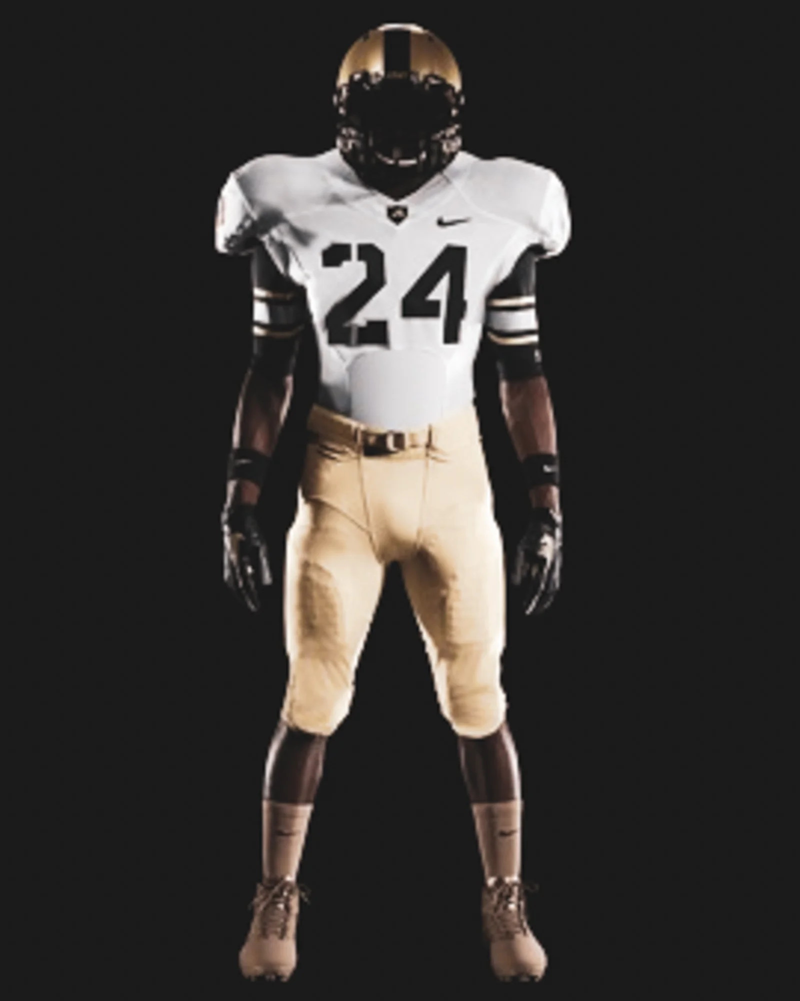
2008
Philadelphia, PA | Lincoln Financial Field
Army 0 - Navy 34
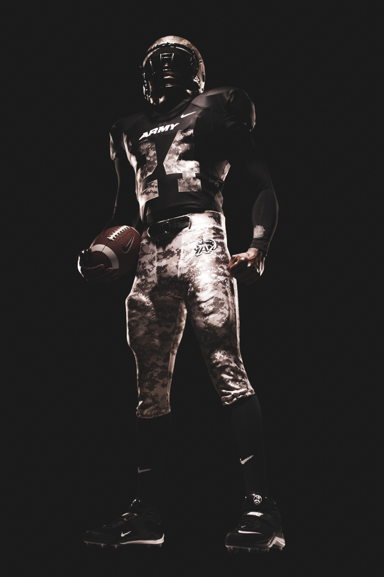

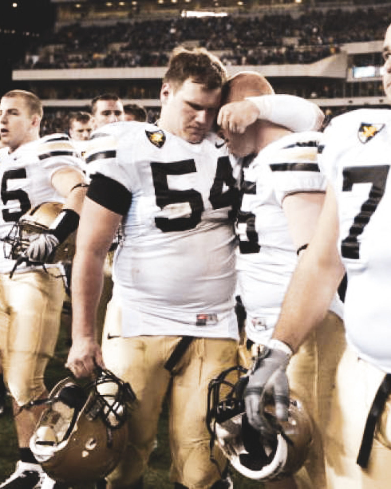
ARMY: Army came out to warm-up in regular season helmet. Gold with black stripe and jersey number adorned on the side. The team returned to the locker room and emerged from the tunnel taking the field under the TWOT-TWOT-TWOT of Apache Helicopters in the ACU-pattered helmet as the Corps of Cadets replaced their service caps with ball-cap camo hats. The solid black jerseys with digital-camo numbers are fitting - not my favorite. They went with DUTY-HONOR-COUNTRY in lieu of a name across the back. Overall, it was pretty cool. That is, until we decided not to score a single point.
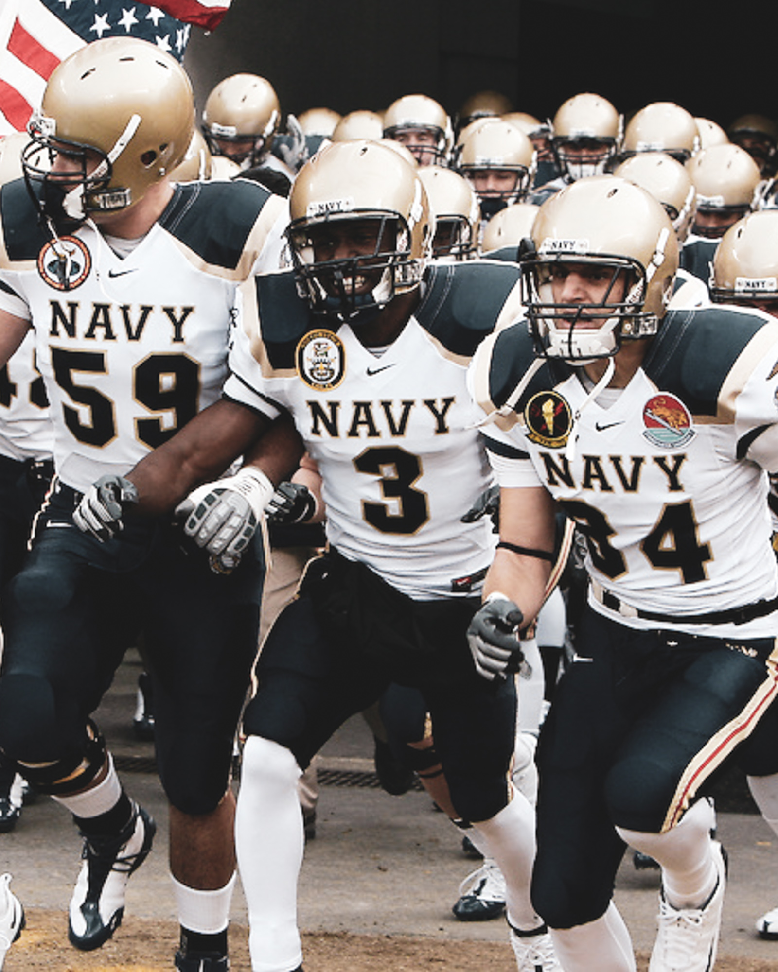
NAVY: Never been a fan of the colored shoulder board. Lame. Navy Sucks.

VERDICT
HELMET: ARMY
JERSEY: NAVY
PANTS: ARMY
SHOES: PUSH
X-FACTOR: ARMY - Cadets in matching headgear
WINNER: ARMY


2009
Philadelphia, PA | Lincoln Financial Field
Army 3 - Navy 17


ARMY: Army did nothing special for the 2009 Army-Navy Game in the uniform department or in the scoring TDs department. Regular season away uniforms…still, a very solid choice.
NAVY: These are very ugly uniforms. The red pipping…gross, dumb.

2009 VERDICT
HELMET: ARMY
JERSEY: ARMY
PANTS: ARMY
SHOES: PUSH
X-FACTOR: Army - West Point patch
WINNER: ARMY
2010
Philadelphia, PA | Lincoln Financial Field
Army 17 - Navy 31


ARMY: If I could go the rest of my life never seeing these uniforms I would be very happy. I, again, am not a fan of the shoulder design, very chunky. The addition of the West Point crest is a head scratcher. Its the mark of a West Point identity crisis.
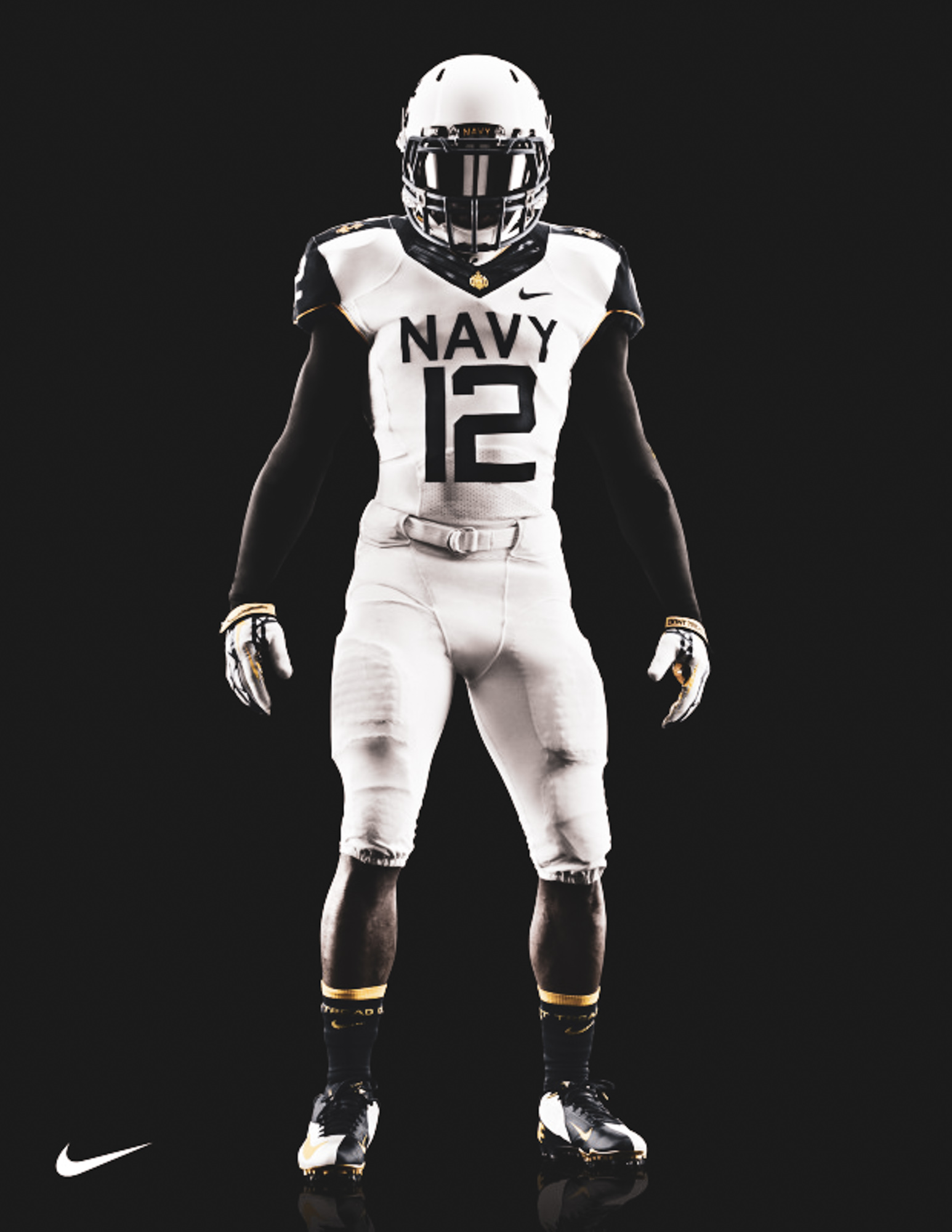
NAVY: They essentially wore the same dumb uniforms as the year before, this time just white. They are less gross but still dumb, mostly because they say NAVY across the front.

2010 VERDICT
HELMET: ARMY
JERSEY: NAVY
PANTS: NAVY
SHOES: PUSH
X-FACTOR: N/A
WINNER: Maybe Nike needed to hit rock bottom to institute change.
2011
Landover, MD | FedExField
Army 21 - Navy 27

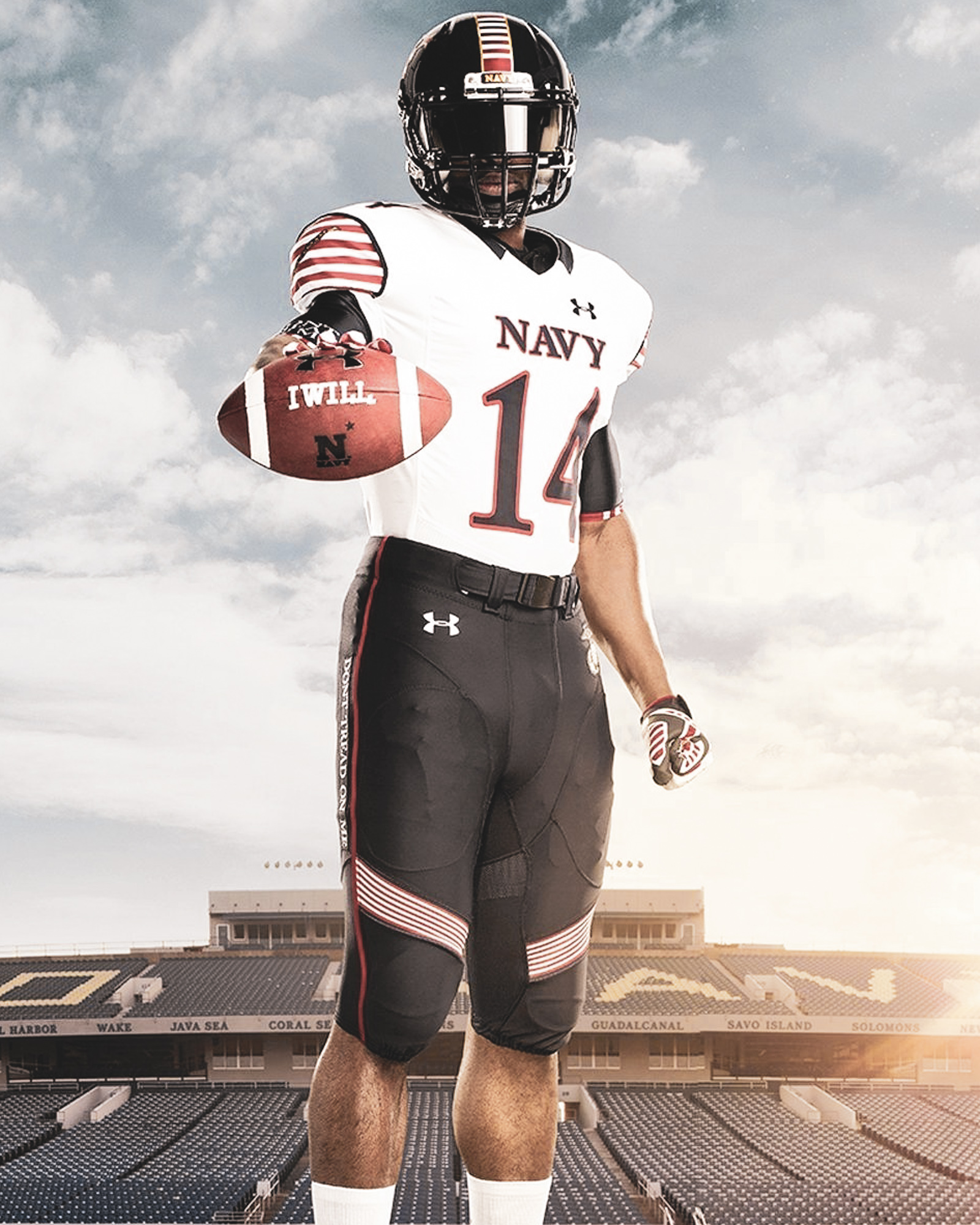
This is the year things started to get serious with the introduction of the Nike Pro Combat uniforms across college football. If there was ever a game to feature the Pro Combat uniform, it would be the Army-Navy Game. It was the first time since 2008 that both teams showed off an exclusive uniform for the annual Army-Navy showdown. Both teams played it relatively safe but did a nice job of upping the ante for pomp & circumstance this game deserves.
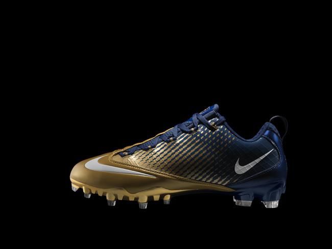
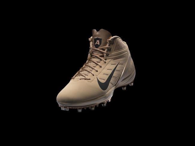
ARMY: While the uniforms, on the whole, are not a far cry from what we now see the Army team wear for away games, at the time they were a nice addition to what they were wearing during the 2011 season. The desert combat boot/shoe-sock look is a nice touch.
NAVY: The gold numbers on midnight navy uniforms is beautiful, and the Navy helmets look good.

2011 VERDICT
HELMET: NAVY
JERSEY: NAVY
PANTS: ARMY
SHOES: ARMY
X-FACTOR: NIKE
WINNER: THE ARMY - NAVY GAME
2012
Philadelphia, PA | Lincoln Financial Field
Army 13 - Navy 17

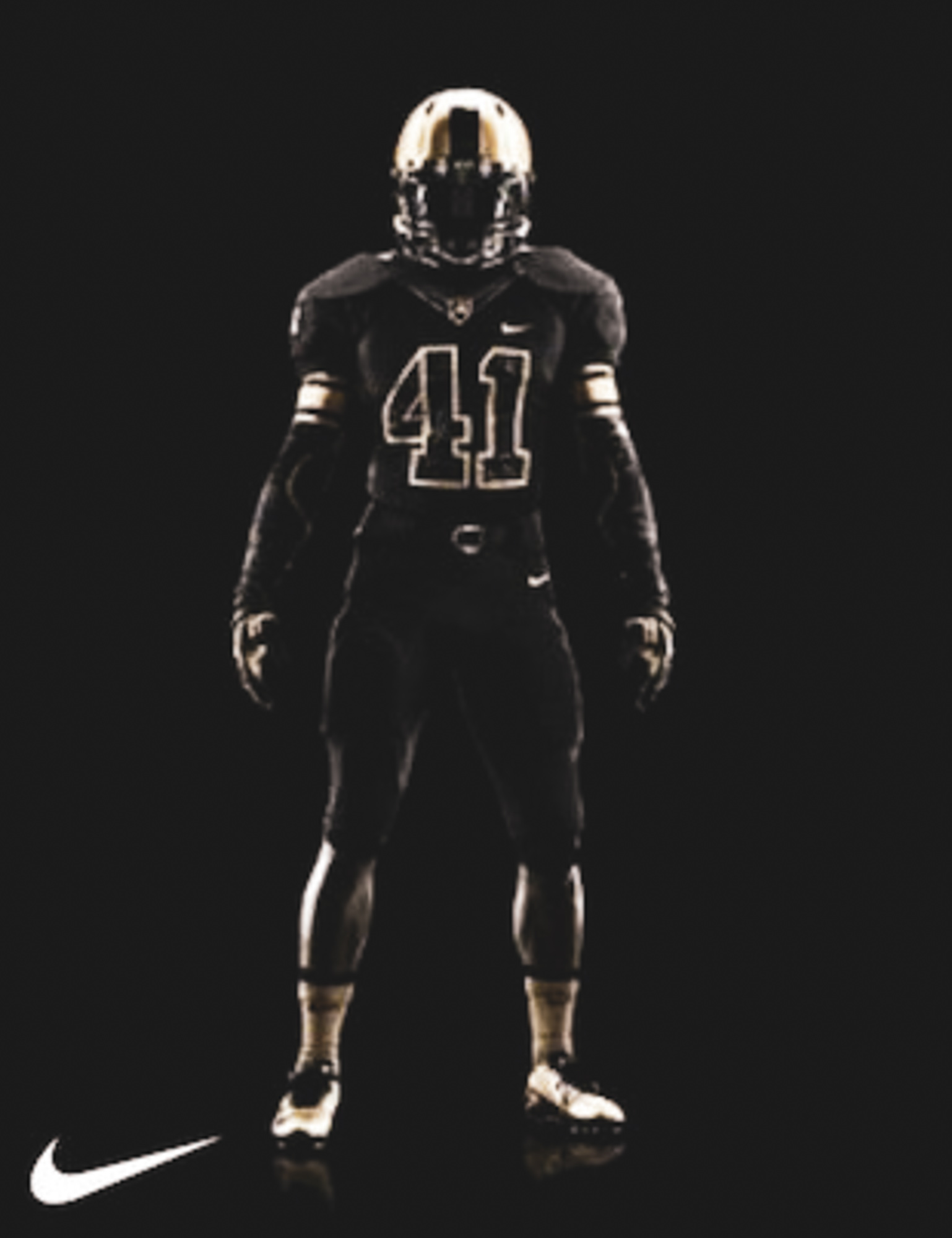
ARMY: All black - CHECK; Battle of the Bulge map on numbers, gloves and undershirts - CHECK; Paying homage to past National Championship team - CHECK; Heartbreaking loss (and fumble) that almost caused me to crash my truck as I ripped my hat from my head and chucked it against the dashboard as I picked up my daughter from some 2nd grader’s birthday party at a stupid jumpy castle place - CHECK.
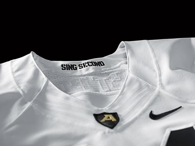
When the Black Knights took the field against Navy they did it in a brand new Army uniform that pays homage to 1944 — the year the football team went undefeated en route to a national championship and the Army troops won an historic victory in the Battle of the Bulge.
Most notably, the new Army uniform features a map of the Ardennes region — the European region where the battle took place — appearing in the numbers, letters, helmet-stripe, base layer and gloves.
Topping off one of the best Army Football uniforms we’ve ever seen, especially in terms of storytelling, was newly-revamped helmet - deep gold tone and black stripe, the new lid paid tribute to the 101st Airborne Division, who played a crucial role in the Allies’ successful counteroffensive at Ardennes.
NAVY: I actually liked their helmet. Its a good example of a modern design done right. Their all-white look is nice, but mostly because it contrast so nicely against Army’s all black look. The epaulette design on the shoulders is a nice touch, as is the number/letter font and relative size to the uniform. The bottom line: Navy just doesn’t look good in all that white.

2012 VERDICT
HELMET: NAVY
JERSEY: ARMY
PANTS: ARMY
SHOES: ARMY
X-FACTOR: ARMY - History & Storytelling
WINNER: Execution

2013
Philadelphia, PA | Lincoln Financial Field
Army 7 - Navy 34


The 2013 game was full of beautiful imagery, thanks to the winter weather at Lincoln Financial Field. There is just something so basic and traditional about these uniforms and the snow that also make them so…right.
ARMY: Designed after the traditional West Point cadet “white over gray” uniform, these uniforms did not do it for me. The gray pants did allow the white jerseys with black numbers jump off the TV screen. This was a uniform. The jersey on its own is solid. The pants on their own are solid. Just the combo is no bueno. It looked much better on the field, however. Unfortunate, because it didn’t help decrease the margin of the loss or the cold, wet snow that day. Firsties also wore red belts, a nod to the red sash, nice.
NAVY: 2012’s helmet was cool. Just not cool enough to reuse. The jersey is nice and the white helmet appropriately compliments the pants. These might be Navy’s best effort up to this point. Nike must have known they were on the hot seat as Under Armor took over Navy Athletics contract the following year.

2013 VERDICT
HELMET: ARMY
JERSEY: NAVY
PANTS: ARMY
SHOES: ARMY
X-FACTOR: Army - This was the first year the merchandise was on-point.
WINNER: Under Armor…as Navy ends its contract with Nike and the uniform rivalry is no longer inter-squad.

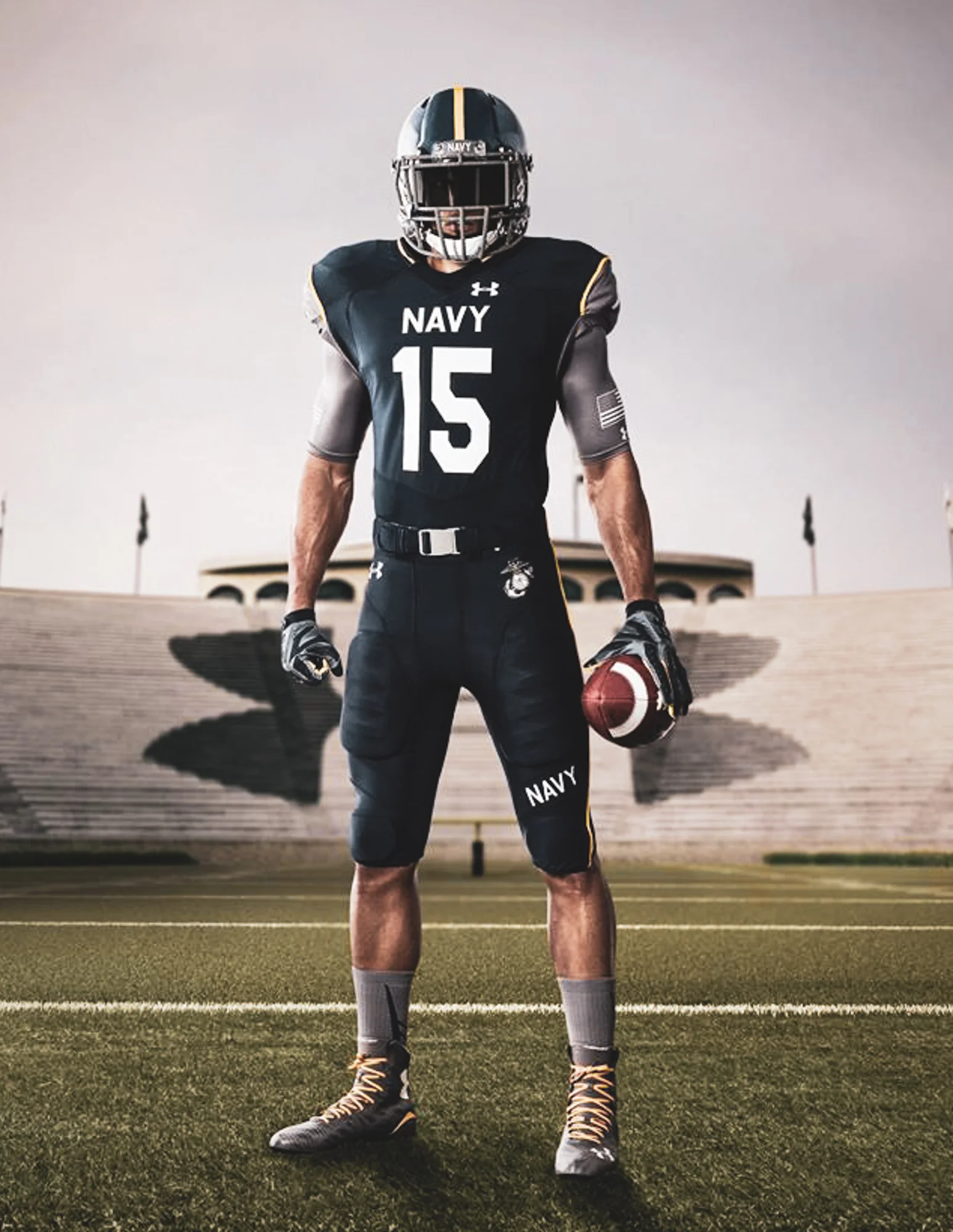
2014
Baltimore, MD | M&T Bank Stadium
Army 10 - Navy 17


This was the year that the rivalry added a new dimension. Enter: Under Armor.
ARMY: Army went with a darker gold than in previous years, and the metallic gold numbers really stand out too. When the sun went down and the lights at M&T bank Stadium came up, these uniforms looked even more intimidating. The all-black look is so, so good.
NAVY: Kinda outrageous. Kinda embarrassing. Kinda cool.

2014 VERDICT
HELMET: ARMY
JERSEY: ARMY
PANTS: ARMY
SHOES: ARMY
X-FACTOR: Army - All-Black wins every time
WINNER: Army
2015
Philadelphia, PA | Lincoln Financial Field
Army 17 - Navy 21

ARMY: A fine uniform for sure. Crisp fonts and a sleek helmet design. Nothing flashy, but a solid overall uniform. I think Army wasn’t ready for what Navy and Under Armor had in mind this year. This was the first Army-Navy Game with the new branding for ARMY WEST POINT, so its hard to imagine that they didn’t want to show off their new marks on the biggest of stages.
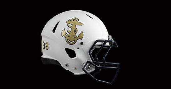
NAVY: The pants and jerseys are styled after a traditional officer's uniform and while good, nothing too special. But what stole the show here was the helmets.
Look at those helmets. The 2015 Navy helmets might be the most ambitiously designed helmets in college football history. The helmets are literally paintings, and they're NOT NEARLY AS GREAT as they seemed in the marketing materials. The prototypes were really nice looking. In-person, not so much.

2015 VERDICT
HELMET: ARMY
JERSEY: NAVY
PANTS: NAVY
SHOES: NAVY
X-FACTOR: NAVY - helmets may have actually sucked, but at least they took a chance and captured the national spotlight
WINNER: Under Armor
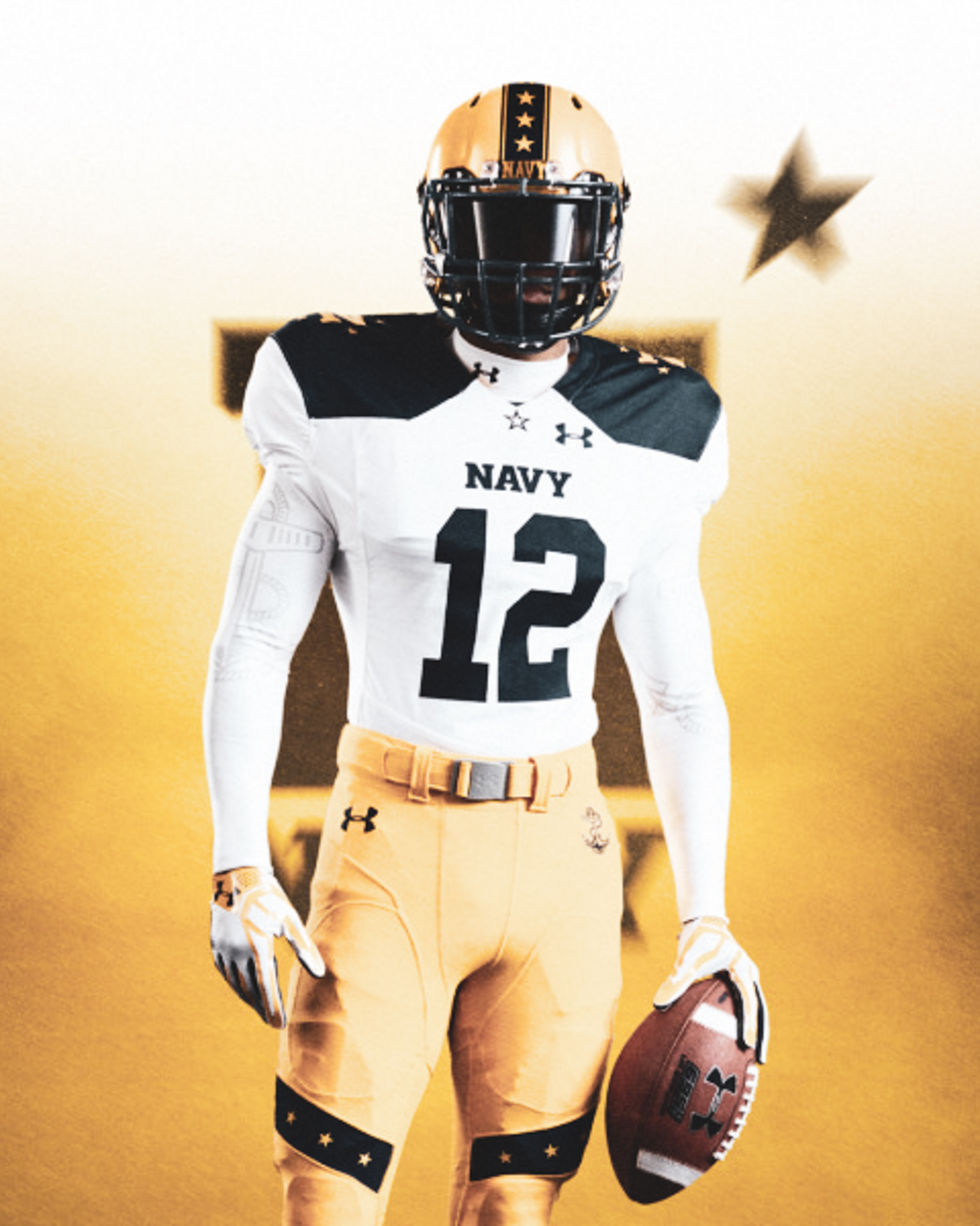
2016
Baltimore, MD | M&T Bank Stadium
Army 21 - Navy 17


Now this competition has hit a new stride. History, storytelling and attention to detail have NEVER been more embraced and properly executed.
ARMY: Perfect uniforms. Minus the numbers. It was an ambitious homage, yes...but they are a little weird and hard to look at. Check out the great microsite for the complete tribute HERE
NAVY: Wolverine? The color combination is fantastic, with the white allowing the yellow to stand out even more than usual. This uniform is borderline outrageous and I kinda dig it. It actually looked better in-person than in the marketing materials. Its also possible that I love these uniforms because that was the game that ended the streak.

2016 VERDICT
HELMET: ARMY
JERSEY: ARMY
PANTS: ARMY
SHOES: ARMY
X-FACTOR: ARMY - Corps of Cadets rushing the field after snapping the 14-year losing streak
WINNER: ARMY
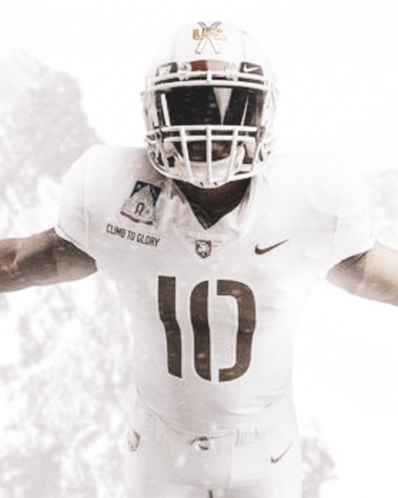
2017
Philadelphia, PA | Lincoln Financial Field
Army 14 - Navy 13


ARMY: There is just so much to like with these uniforms. The white, the snow, the panda, perfection. Do yourself a favor and just go check it all the details HERE
NAVY: Another instance of the marketing materials looking real, real nice. The tribute to the Blue Angels is cool, but not as cool as a tribute to the 10th Mountain.But at the end of the day, the uniforms did not not hold up in person or on TV. There was a clear color shift between the helmets and the rest of the uniform that made the uniforms look pretty bad. Also, sky penis jokes.

2017 VERDICT
HELMET: ARMY
JERSEY: ARMY
PANTS: ARMY
SHOES: ARMY
X-FACTOR: ARMY ALL WHITES + SNOW = CAMOUFLAGE
WINNER: PHOTOGRAPHERS - so many iconic photos from this game.


2018
Philadelphia, PA | Lincoln Financial Field
Army - Navy
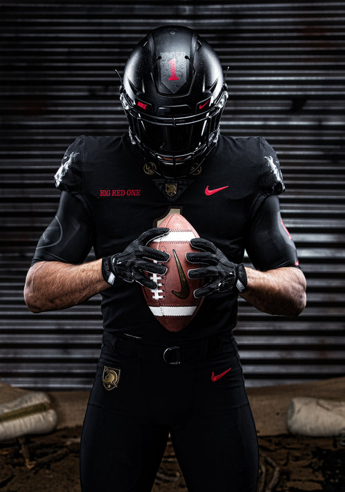
ARMY: For the third consecutive year Army knocks it out of the park. I am most impressed with the commitment to simplify over the past 3 years. All dark gray with the 82nd Airborne, all white for the 10th Mountain and all black for the Big Red One. I am just beyond happy that the powers at be have harnessed the history and tradition complete with backstory, relevance (Big Red One = 100th anniversary of the end of WWI) and going the extra mile to include adorable and gritty unit mascots. This year meet RAGS.
“There’s no better uniform than the uniform of the Black Lions to represent the tenacity and bravery of the American Solider in WWI. And thats why we have a uniform that focuses on PEOPLE, on SOLDIERS and on the BRAVE PEOPLE who were called on to lead. The Army Football team deserves a uniform that shows the bravery and tenacity of the American Solider.”
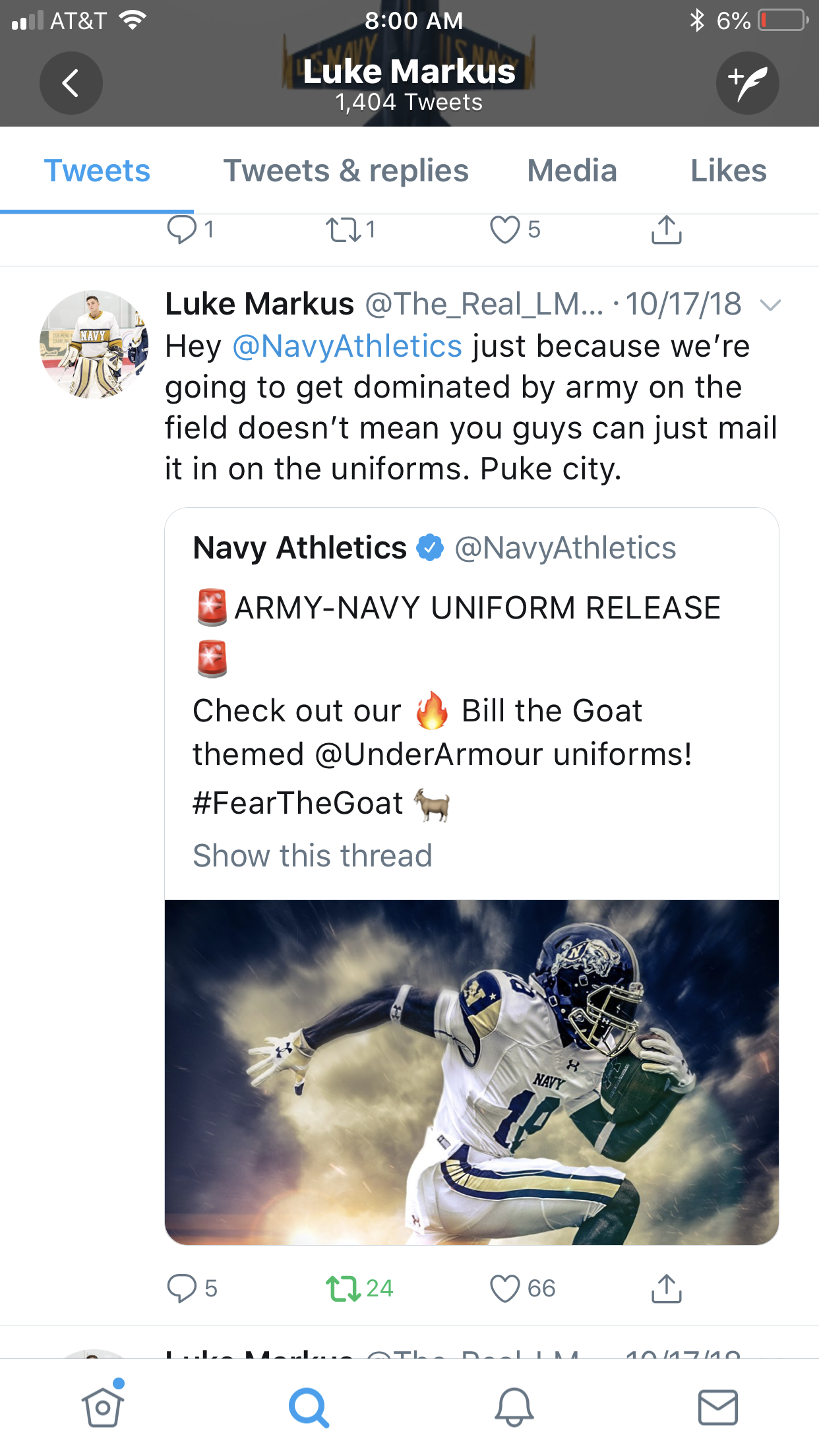
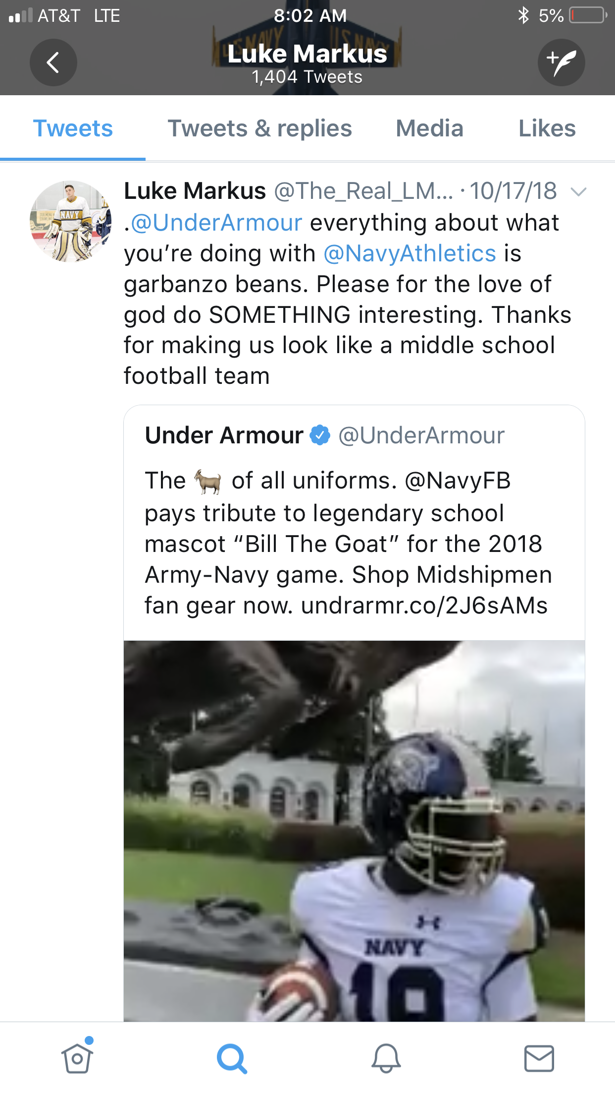
NAVY: A goat. A tribute for a goat. A trash eating boat dumpster (look it up). That is all. Army honored humans, brave and tenacious humans from the “War to End All Wars” and Navy honored a goat.
The helmet is sorta cool, if it didn’t have a goat on it. They also released these uniforms back in October for some ungodly reason. Their own midshipmen even railed against Navy’s poor effort. Navy gets what they deserve.
#RaiseTheFail

2018 PREDICTION
HELMET: ARMY
JERSEY: ARMY
PANTS: ARMY
SHOES: ARMY
X-FACTOR: RAGS
WINNER: ARMY

What’s your favorite uniform? Which combo is the strongest? What did we get right? Wrong? Let us know in the comments.